Upgraded forums. It was a major upgrade. Lots of behind the scene stuff. Had to try and reconstruct the styles. I got them close. If anybody notices any issues, post them here. As the week goes on I'll keep tinkering with the styles to get them back to what I remember they are.

Forum upgrade to 2.2.X completed... mostly!
- Thread starter Plainview
- Start date
You are using an out of date browser. It may not display this or other websites correctly.
You should upgrade or use an alternative browser.
You should upgrade or use an alternative browser.


I like this new look.
the only issue is when someone updates a new reply, it won't be a different color
the only issue is when someone updates a new reply, it won't be a different color
Last edited:
Fixed.Put the notifications back on the bottom of the screen!!!
Show me a pic.I like this new look.
the only issue is when someone updates a new reply, it won't be a different color


i like it, seems to load fast, snappier, more streamlined and clean.
The tiny logo is indeed tiny, when on mobile....kinda miss the animated buttons where they were like touching a reflecting pool when pressed, but I’ll live.

FixedLike the topic about VR, it just gets bold letters instead, also some icon missing next to my profile on the top right.
Looks to have been fixed. I can see everything on my Mac at work now. Couldn't on my MacbookPro at home.

Fixed.I like the new font. Are there any standout new features?
I liked having the gif button on the main toolbar:
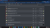
View attachment 4097
I like the chages, but I feel like there's a lot of empty real estate on the desktop version. Can you make it so the entire thread title shows to help use up some of that space?

EWE...dark theme. Go light, it's bright.I like the chages, but I feel like there's a lot of empty real estate on the desktop version. Can you make it so the entire thread title shows to help use up some of that space?
View attachment 4098

noEWE...dark theme. Go light, it's bright.
Not sure. The sidebar also disappeared too.I like the chages, but I feel like there's a lot of empty real estate on the desktop version. Can you make it so the entire thread title shows to help use up some of that space?
View attachment 4098
It was because sidebar was missing. It's now back to how it was.I like the chages, but I feel like there's a lot of empty real estate on the desktop version. Can you make it so the entire thread title shows to help use up some of that space?
View attachment 4098
What style are you using?Plainview getting pop up ads today browsing the forums from my phone. They take up 2/3 of the screen (can only see bottom 1/3) with no way to exit them. Can’t see what is at the top 2/3 of the page.
It’s when looking through the thread lists not in the threads themselves.
You were using UI.X. Should be fixed now.Plainview getting pop up ads today browsing the forums from my phone. They take up 2/3 of the screen (can only see bottom 1/3) with no way to exit them. Can’t see what is at the top 2/3 of the page.
It’s when looking through the thread lists not in the threads themselves.
You were using UI.X. Should be fixed now.
Still getting them.
Close tab and reopen. UI.X Light, right?
They’re not coming up now. Thanks.
Added two new styles and changed the forum default to the new UnionVGF BLOK Dark. If you liked the older ones, you can change it back to UnionVGF Light or Dark at the bottom of any page.